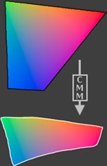
Colour management is very important to ensure that the printed photograph looks the same as what the image on screen does.
The problem with trying to produce photographic prints that look exactly like what the photographer first saw, is that each device; the camera, the computer / monitor and the printer has its own limit on how it can handle the colour spectrum.
Whilst the camera and computer / monitor can handle their range of colours and tones, sometimes called their colour spaces or gamuts, the printer then has to translate this collection of colours in the format of RGB (Red, Green and Blue) and translate these into its gamut in the format of CMYK (Cyan, Magenta, Yellow and blacK).
As you can see from the diagram below, there are still some differences in the actual colours tones that are displayed on the computer screen and those on the final print out, which appear more muted and less vibrant:
An important consideration is the type of paper used for the final print out, as using normal paper would result in very drab colours with plenty of colour bleeding into other colours on the paper.
The above diagram demonstrates the difference between the RGB and CMYK colour gamuts. The CMYK colour gamut is much smaller than the RGB colour gamut, thus the CMYK colours look muted. If you were to print the image on a CMYK device (an offset press or maybe even a ink jet printer) the two sides would likely look much more similar, since the combination of cyan, yellow, magenta and black cannot reproduce the range (gamut) of colour that a computer monitor displays. This is a constant issue for those who work in print production.
One reason for the differences in the colours and tones available between RGB and CMYK is that RGB uses additive colour mixing, because it describes what kind of light needs to be emitted to produce a given colour. Light is added together to create form from out of the darkness. RGB stores individual values for red, green and blue. RGBA is RGB with an additional channel, alpha, to indicate transparency.
 |
| Additive colour mixing: Three overlapping light bulbs in a vacuum, adding together to create white. |
Common colour spaces based on the RGB model include sRGB, Adobe RGB and ProPhoto RGB.
CMYK uses subtractive colour mixing used in the printing process, because it describes what kind of inks need to be applied so the light reflected from the substrate and through the inks produces a given colour. One starts with a white substrate (canvas, page, etc), and uses ink to subtract from white to create an image. CMYK stores ink values for cyan, magenta, yellow and black. There are many CMYK colour spaces for different sets of inks, substrates, and press characteristics (which change the dot gain or transfer function for each ink and thus change the appearance).
 |
| Subtractive colour mixing: Three splotches of paint on white paper, subtracting together to turn the paper black. |
- sRGB
- AdobeRGB
with the later colour space yielding a much more range of colours and tones, but, as you can see from the diagram below:
none of the available colour spaces cover all of the visible colour spectrum.
To try and solve this problem of accurate colour reproduction on both the computer display and the final printout, the ICC (International Colour Consortium) developed a range of ICC profiles which can be used to more accurately translate the true colours from one device to another to ensure the finished photograph looks the same as what the photographer first saw through their viewfinder.
These ICC profiles are simply look-up tables that describe the properties of a colour space. They define the most saturated colours available in a colour space; ie the bluest blue or deepest black your printer can produce. If you don't have a profile, the trio of Red, Green, and Blue values (or CMYK (Cyan, Magenta, Yellow and Key or black)) that make up a colour have no particular meaning — you can say something is blue, but not exactly which shade of blue. Accurate profiles are the key to a colour-managed workflow. With accurate monitor and printer profiles, your prints will closely match what you see on your monitor. Without profiles, you need to rely on trial and error combined with good old-fashioned guessing.
Colour Space Conversion
| Input | Conversion | Output | ||
 |  |  |
Colour space conversion is what happens when a colour management module (CMM) translates colour from one device's colour space to another. Conversion may require approximations in order to preserve the image's most important colour qualities.
The translation stage attempts to create a best match between devices-- even when seemingly incompatible. If the original device has a larger colour gamut than the final device, some of the those colours will be outside the final device's colour space. These "out-of-gamut colours" occur with nearly every conversion and are called a gamut mismatch.
 |  |


Hi,
ReplyDeleteThe science of this is an important element of what you are required to produce, the application of these principles are vital in the calibration of a digital workflow.
Well labelled as normal pete, keep it up.
Steve