Sunday 30 January 2011

ICC Profiles


After writing about colour management, printer (and monitor) calibration and printing the photographs, both theory and practice at Burton College and via D S Colour Labs, I thought I had better do a short blog on ICC Profiles.

The term ICC refers to the International Colour Consortium.

Understanding what a profile is will help you fully comprehend what happens in colour-managed transformations. An ICC profile is a standard way of numerically defining the way a particular device (a scanner, camera, printer or monitor) renders colour for a human observer under average daylight conditions. Colour management involves linking these various device profiles together in a way that allows us to control the appearance of colours from one device to another. In order for this to work, a profile must reference the observable colours from a device to a device-independent model, a sort of absolute definition of colour. Profiles are static definitions, and the dynamic calculations that move an image file through various profiles to arrive at the final output are handled by a colour management module (CMM) that’s the mathematical engine for all the transforms.

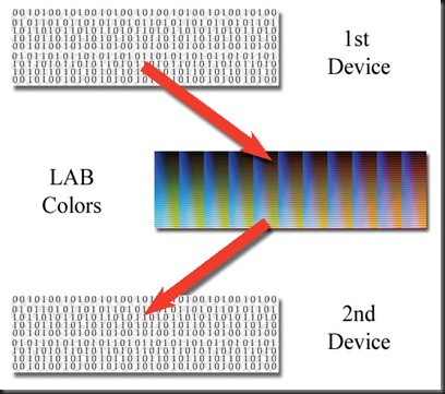
Therefore, a profile is a special number transformer, a kind of black box called a lookup table (LUT), or more often a colour lookup table (CLUT), which takes a set of numbers and returns another set of numbers. The first set of numbers can be from any kind of colour device (RGB, CMYK or grey scale); the second set of numbers is the LAB definition of the colour represented by the first set.

ICC profiles 1

The above might look confusing, but it is important to remember that all computers work on binary, and that even that picture you took on location or in Burton College’s studio, is seen by the computer as simply a series of 1s and 0s.

A profile “looks up” the LAB value for a colour in a specific colour space.

You can think of LAB numbers as being independent of any particular device but representative of colours observable under D50 graphics industry-standard lighting. Therefore, a profile gives us a real colour definition of the numbers from a digital file—in D50 light.

Some profiles are relatively simple rules based on a matrix with a few points defining a larger set of colours. Other profiles are larger plots of all possible colours in a particular set. Matrix profiles are commonly used for Photoshop’s working spaces and monitor profiles. Printer profiles are most commonly larger CLUTs, sometimes referred to as table-based profiles. The math surrounding all this is staggering. For the artist, a profile is merely a definition of the colour rendered by a device translated into LAB. When photographers need to transform one set of device numbers into numbers for another device, they use profiles to “look up” the LAB colours and generate new numbers for the next device based on those colours.

ICC profiles 2

LAB Colour is the link between the two device numbers.

When the profiles for the devices you’re using are installed, you simply have to select the appropriate profile at the right time to manage the necessary colour transforms.

Friday 28 January 2011

Printer Calibration

The final element of the digital work flow, the printer, has to be calibrated to ensure that all you hard work, composition, capture, conversion / processing, etc, is not all in vain.
 
Photographs looking different when displayed as opposed when they are printed is not a new issue that has been created with the digital revolution.  Paul, my brother, used slide film for years because he liked how the colours were more vibrant and true to what he saw when he took the photograph, when they were shown on a slide projector,  in a similar way to how our images look on the screen, but when prints were taken off the slides the photographs lacked the vibrancy and punch that he saw when it was projected on to a screen, in the same way as our photographs lack these features when our photographs are printed out.
 
It is important to note thought that a calibration has to be carried out for each printer / ink / paper combination, so basically it is best to stick to one make of ink and one type (finish, weight and even manufacturer) of photographic quality paper.  Some papers are promoted as bright white in colour as opposed to just white.
 
Some photographic paper manufacturers, for example permajet, offer a service whereby the photographer buys a pack of their paper, they produce a print using their combination of printer / ink / with the manufacturer’s paper, and send this to the manufacturer who analyses the colours against the original image.  The manufacturer then sends a custom ICC profile for their paper when used with the photographer’s printer and ink.
 
The ICC profile for a printer is created by comparing a test print result using a photometer with the original reference file. The test chart contains known CMYK colours, whose offsets to their actual L*a*b colours scanned by the photometer are resulting in an ICC profile. Another possibility to ICC profile a printer is to use a calibrated scanner as the measuring device for the printed CMYK test chart instead of a photometer.
 
A number of manufacturers, like Huey, Eye-One, etc produce kits which can calibrate monitors and printers, using colour photometers, to maintain full colour management from the beginning of the workflow right through to the end print.
 
Some software, such as Adobe’s Photoshop has a soft proofing option that can be used to simulate on screen how the photograph will actually look on paper, colour and depth wise as opposed to a simple print preview, which just shows how the image would fit on the page.
 
Below is an example of how an image looked on the computer screen, and how it looked on the soft proofing simulation from Adobe Photoshop:

on screen and print simulation

This example shows how prints can lack the punch that on screen images have.
 
The problem is that no matter how ‘bright white’ you paper might be, it would never look as bright as a monitor screen.
 
 
Using ICC profiles
 
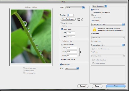
When you choose the print option from Adobe Photoshop, you will get this requester:
 
Print options

When the print dialog comes up, make sure you have Colour Management selected in the drop-down at the upper-right corner; most of the important printing options for our purposes are in this area (Figure 4). This is where you set up all the Profile options for your prints.

At the centre of the dialog, Position controls how the image lays out on the page. The Centre Image check box provides a quick way to place the image. Directly below that is the Scaled Print Size area; by default, this is set up for 100%. If the image is way too small or way too big on the page preview, click the Print Settings button and make sure you’re using the right-sized paper. Checking the Scale To Fit Media check box is a quick and dirty method of sizing the image to fit the paper; just beware that your quality will suffer if the reported Scale percentage is overly high. It’s far better to set the size properly in Photoshop before using the dialog. The Bounding Box check box is useful when you have an area of white canvas in your image—the bounding box shows the edges of the image against the white of the paper.
 
The important colour settings reside in the right third of the dialog box. The two radio buttons directly under the Colour Management drop-down identify whether you’re going to print the document directly or generate a simulation proof; if you’re making prints for your portfolio or to sell to a client, you’ll probably check Document because this generally will provide the highest-quality print for your image. This sets the profile to the document colour space and determines from where the colour starts in its journey to the print.
Next is the Colour Handling area. For RGB images, the Colour Handling drop-down shows Photoshop Manages Colours, Printer Manages Colours or Separations.
 
Photoshop Manages Colours. Selecting Photoshop Manages Colours allows you to select the Printer Profile in the drop-down menu just below this one. This is the most straightforward way to set up colour management for the print. If you select Photoshop Manages Colours, remember to turn off colour management in the printer dialog!
 
Printer Manages Colours. If you select Printer Manages Colours, the Print Profile option will be greyed out, and you’ll have to set the Colour Management options in the printer driver. The Printer Driver dialogs are usually a lot more confusing in this regard, so you would be wise to stick with Photoshop.
 
Separations. Separations will be available only if you’re printing from a CMYK document; otherwise, it will be greyed out. This is used only when printing separate cyan, magenta, yellow and black “plates” or simulations, and for the most part, you can ignore it.  This type of printing is only really for use with printing companies who use the traditional plates method of printing.  Below is a screen grab from PhotoPlus with the colour separations and Prepress options:
 
Printing separations

The last choice is Rendering Intent. Here you can choose: Perceptual, Saturation, Relative Colorimetric or Absolute Colorimetric. 90% of the time, Relative Colorimetric will give you the best result. Occasionally, certain very saturated colours will tend to posterize and lose detail in the print. If this is the case, you can try to solve the problem with Perceptual rendering.
 
Generally though, Perceptual rendering will give a less saturated colour in the print, and your skin tones could become dull. The other renderings are applicable for custom profiles and unusual circumstances; however, for the most part, you can ignore them with people images.
 
Beginning with Photoshop CS5, the large preview in the dialog is colour managed and has some check-box controls underneath the preview. Checking Match Print Colours, by default, checks the other two boxes you can uncheck them if you desire. Gamut Warning renders flat areas of grey over any colour that’s out of gamut for the selected printer profile. Show Paper White puts a tone into the white areas of the preview in an attempt to simulate the effect of the paper colour on the image (much as you can with the Custom Proof Setup under the View Menu). The preview also can be used to reposition the image directly. If you uncheck the Centre Image check box in the Position area, you can click the image preview and move it around on the page and/or rescale it by dragging on the corner handles in the bounding box (if you uncheck the Bounding Box, you won’t be able to do this).
 
Once all your options are set, you’re free to click Print. The only additional thing you need to remember is that if your colour management options are being set in Photoshop, you have to turn off any such options in the Printer Driver dialog. All of the colour transformations will have taken place already in Photoshop before the data hits the printer driver, so make sure you don’t “double colour manage” and introduce an additional transformation. Every printer driver is a little different, but yours will have some option to select no colour management in the printer driver.

Wednesday 26 January 2011

Monitor Calibration


When we use a computer (windows based, Mac, Linux, etc) we see everything via the computer’s monitor.  Whilst everything might look alright on the screen when creating documents, when it comes down to working with photographs, it can be another matter.

Ambient lighting, where you are working, is very important as it can lead to subtle differences, for example normal tungsten lighting can sometimes produce a slight colour cast, not only when taking the photographs, but later when you are working on them.  So it is important to make sure that the room in which you are working is well lit, not just for obvious health and safety purposes.

Basically there are two types of computer monitor CRT (the older bulky monitors) and LCD (flat screen monitors).

Whilst LCD monitors are becoming more common place, some do suffer from the problem that if it is viewed from an angle the colours do look different.

There are two methods of calibrating a monitor:

  1. Visual
  2. Mechanical


Visual Calibration

Visual involves either using the standard built in tools for setting the screen:

Monitor Calibration 1

Some will choose to make use of more accurate colour calibration charts, which show a wide range of colours, and different levels of grey, can help detect more subtle colour differences:

Reference Print monitor 900x600pixel

Close together lines can be used to check for sharpness of the printer.  In fact the above chart is available for calibrating printers as well.
But visual calibration does rely on the eye of the photographer.


Mechanical Calibration

This type of calibration is more accurate, but can be very expensive.

There are tools like the Eye-One which can be used to calibrate both your computer monitor and your printer.

For calibrating the monitor a colorimeter is attached flat to the display's surface, having been shielded from all ambient light, to avoid errors caused by colour casts.

Below is the colorimeter from the Eye-One package analysing the red square on the computer monitor

Monitor colour calibration 2

The calibration software sends a series of colour signals to the display and compares the values that were actually sent against the readings from the calibration device. This establishes the current offsets in colour display. Depending on the calibration software and type of monitor used, the software either creates a correction matrix (i.e. an ICC profile) for colour values before being sent to the display, or gives instructions for altering the display's brightness/contrast and RGB values through the OSD. This tunes the display to reproduce fairly accurately the in-gamut part of a desired colour space.

Tuesday 25 January 2011

Final Selections

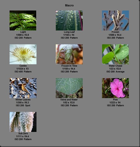
Below are my final selections for Architecture and Macro:

Architecture


Macro

These have all been printed out as A3 prints and included in my portfolio.

Monday 24 January 2011

Feedback from other students

With the work space for this course being online this offers a host of benefits over the traditional workbooks and portfolios that have been used for years.
 
One of these is that we can look at each other's work and provide them with our feedback concerning their photographs and written content. Sometimes this feedback can be very useful because it is from someone else, who is studying with us, who may feel that something is missing from our work, where because we ourselves are so close to our work, we sometimes miss things out or go off on a tangent away from what we are trying so say.
 
Feedback can often bring praise from others who see things in our work that we have not seen ourselves. For example some of the feedback that I have received about my final images have made me feel a little happier about some of my images. Sometimes it can re-affirm some of my doubts over a particular image and give me an opportunity to re-assess my final line up of images.
With the work online we can receive this feedback, almost immediately, whilst on the course and decide if we are right in the direction that we are travelling in and make changes if necessary, rather than finding out too late.
 
Working with fellow photographers like this we can all learn from each other, as well as the tutors, and share our thoughts and options.
 
In fact, this format is so accessible that this post on the blog was actually wrote on a mobile phone !

Sunday 23 January 2011

Traditional Photograph Sizes


This may seem an odd subject for this blog, but trust me it will all make sense.

The sizes of traditional (or film based) photographs are based on the size of the 35mm negative (24mm x 36mm) which is based on ISO 1007 which was introduced by Kodak in 1937.

The most common sizes are:

Print

Size

Ratio

MM

Inches

Pixels *

3R

89 x 127

3½ x 5

1051 x 1500

10:7

4R

102 × 152

4 x 6

1205 x 1795

3:2

5R

127 x 178

5 x 7

1500 x 2102

7:5

6R

152 x 203

6 x 8

1795 x 2398

4:3

8R

203 × 254

8 x 10

2398 x 3000

3:2

S8R

203 × 305

8 x 12

2398 × 3602

3:2

10R

254 x 305

10 x 12

3000 x 3602

6:5

12R

305 x 381

12 x 15

3602 x 4500

5:4

S12R

305 x 465

12 x 18

3602 x 5492

3:2

* Based on a DPI of 300

These sizes, some of which are based on a ratio of 3:2, however, do not match the (ISO) sizes of paper which are available for printing photographs at home !

This means that although you might frame your subject as you want to see it in the viewfinder, you will have to crop it later for the printing stage.

Paper Sizes


When buying paper for printing out photographs the most common sizes are based on the International Standard ISO 216, which is based on the German DIN 476 standard for paper sizes, are shown below:

a-series-paper-sizes-1

With the most common used size being A4, which is available in a number of different finishes and thicknesses.  It is important to note though that some countries, like America use a different system which includes sizes like letter, legal and ledger and Japan have their JIS (Japanese Industrial Standard).  Some people still refer to foolscap as this was a common paper size in the UK, before the new ISO standard was accepted.

For this assignment (Unit 310) I will be using A3 paper supplied by D S Colour Labs for the majority of the prints, and A3+ for the last print which will be printed at Burton College.  This last print will have to be trimmed to fit the presentation folder which is A3 in size.

The ISO paper size A standard is based on each size being half of the size of the previous one, when folded parallel to the shorter lengths. This system allows for a variety of useful applications, such as the enlarging and reducing of images without any cut off or margins, or folding to make a booklet of the next size down.

The ISO 216 definition of the A paper sizes is based on the following basis:

  • The length divided by the width is 1.4142
  • The A0 size has an area of 1 square metre.
  • Each subsequent size A(n) is defined as A(n-1) cut in half parallel to its shorter sides.
  • The standard length and width of each size is rounded to the nearest millimetre.

Saturday 22 January 2011

Evaluation: Print Run 2 - College

Initially, there were problems producing the print, with printer errors.  After these few problems were taken care of the image was printed.

There were clear signs of banding on the image, mainly on areas where there was darker colours.  On green areas there was no sign of banding at all, which suggests it involved the magenta print head may have a blockage.
 
The finish on the paper was matt like, which I felt suited the image nicely, because sometimes using gloss finished papers the sheen can detract from the image, and even show up any problems at the mounting stage, in the form of lines across, or down, the print.
 
The colours that were printed were an accurate reproduction of what was on the computer screen, with the obvious exception of the banding.

Other than that I was happy with the print quality, and would like to thank all those concerned with their efforts in solving these issues enabling me to print this image.

Print Run 2 - Burton College

The final prints I am printing at Burton College, where I will have full control over the final stage of the process.

For this example I am printing the image 'Water Chase'.

So the first stage will be sizing the image, for the printing stage:


the size 420 mm by 297 mm was entered into the size options with a resolution of 300 dpi.

Then the crop tool was dragged out across the image to select what I wanted to keep.  I kept the option of using the rule of thirds grid selected.


Once I was happy with the crop, I saved the image as a PSD (Photoshop image) file:


One advantage with this way of working is that you don't end up working on part of the image that will later be cropped off, which is a waste of your most valuable resources - time.

The next stage involved checking the histogram:


When making adjustments like this, I use adjustment levels because I can make changes to the adjustment, or text in the case of a text layer, or even hide the level if I am not happy, but still want to keep the adjustment for editing later.

In this case the levels were ok.

Next came the printing stage

Printing 1

First thing to do was to change the orientation of the print from portrait to landscape, then change the printer from a laser printer to one of the colleges A3+ printers.

Next it was changing the paper size from the default A4 to the A3+ paper we were using for the printing:
 
Printing 2
Then came the attack of the Gremlins !

Printer error


After a few glitches, they solved the problem and I managed to print out the final image.
 
Thanks to Mr Steve and Steve B for their hard work in solving this problem.


Wednesday 19 January 2011

Evaluation: Print Run 1 - D S Colour Labs

Collected the prints today from the Burton Sorting Office.  I was working outside in the garden for about half an hour, after waiting in for them to arrive, only to find that they had been and left a card for me to take to the sorting office to collect it.

In evaluating the the prints, I will also look at the condition of them from the point of packaging because this is important as it protects the prints from damage during transit from the printers to me.


Packaging


When D S Colour Labs send out prints they take great care in packing them between two plastic / cardboard sheets taped together to form an envelope, with the invoice attached, to keep them flat and protect them from creases and folds.  This is inside a strong corrugated cardboard box, clearly labelled with the addressee’s name and address with a return address in case it could not be delivered.
The box was in good condition when I collected it, with the prints safely inside, protected by the plastic / cardboard, with the tape in tacked.


Print Quality

The print quality is very good, with no signs of banding, or any other printer faults, and by selecting the auto corrected option, where the image is lightened slightly, (especially after finding some previous prints seemed to come out darker than what I expected), the prints matched the images on the computer screen.  So obviously D S Colour Labs have responded to peoples comments about the darkened prints, and provided an option where this is automatically corrected.


Finish

The finish was very good, with a matt like finish which seems to provide a more clear and defined edge to lines which gloss finishes can sometimes lose. 


Colour Management

The colours were faithfully reproduced, but without too much saturation, which I have heard some companies do to emphasise the images too much.  The whites were white without any colour cast and details remained sharp.


Crop

The images were as I uploaded them without any form of crop, with a narrow band along one edge.


Overall Evaluation

Another case of a fast turn around from uploading the images to receiving the finished prints, with a very high quality print quality, good finish and accurate colour management.  D S Colour Labs have obviously listened to peoples concerns over darker prints and provided an option on the print size and finish menu to correct any problems.
 
My only comment, which has nothing to do with D S Colour Labs, but an evaluation of one of the prints is that on 'Cooper's Square' the image is a little pixelated, but this is more due to the camera I used, on a mobile phone, which would never deliver the quality of a SLR.  But this shows what a mobile phone camera can deliver, and it's limits.
 
No prizes for guessing where my next set of A3 prints will be printed !

Monday 17 January 2011

Research

One cornerstone of any course is research, and this course requires research both into work of other photographers and techniques and equipment necessary to achieve the high standard of work required to pass the course. Below are some of the resources that I have used during this course.
 
 
The Internet
 
Today the internet provides a huge resource of information for students of all subjects from archaeology to zoology, but care has to be taken in identifying what sources of information are accurate and reliable. For example Wikipedia is a website hosting all kinds of information, but the source of the information are not always one hundred per cent correct. I therefore choose to look at several websites and compare the information and assess what information is correct. Often the photographers will themselves have a website, with information about themselves. Although occasionally they will not have this information readily available and this will mean emailing them and asking them some questions myself. Unfortunately, some do not respond, or will answer the questions 'yes' or 'no'.
 
 
internet
 
 
Our Group
 
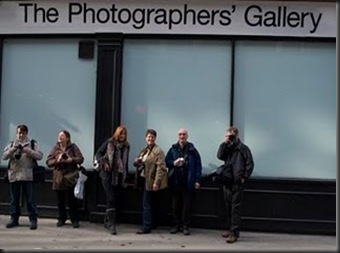
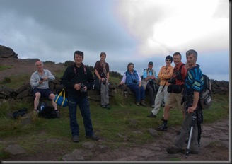
I am very fortunate to be studying with such a good group of people, starting out as other students, now as friends, who work together and share their knowledge and experiences. We have been on some photography trips, sometimes just those from the courses (this one and previous photography courses) other times with members of the Burton Photographic Society, of which I am a member. We have had some good trips, but with recent commitments I have been limited in joining the group for some recent trips.
 
 
Gallery
 
In fact, some photographs taken on one of our groups trips, to Chalk Abbey, where we photographed their deer, are on exhibition at Burton Queens Hospital.
 
Steve (Mr Steve), the tutor provides support, help with the college’s photographic studio and gives us access to a number of books from their library.
 
 
Burton Photographic Society
 
A group of like minded people who share information, and hold special nights where guest speakers come in and talk about their work and experiences. Last year Peter Clarke gave a series of Photoshop tutorials. Again, due to recent commitments I have been limited in attending the club nights.
 
Photographers4
 
The College
 
As well as running the course and providing the studio and other facilities, the college invite guest speakers to present their work and thoughts. So far I have been to one night where Joe Cornish was presenting a very interesting and inspirational speech on his landscape photography. There is another presentation this week which I am hoping to attend.
 
 
University Block_IGP9220
 
 
Books
 
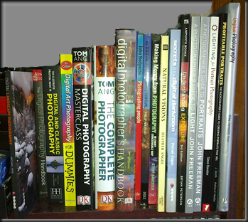
Since starting my first photography course, my collection of photographic books has quadrupled !, explaining why my bookcase is now struggling under the weight. I have added six books to my library since Christmas 2010 !
 
Although books can become out-dated, in particular in the case of law studies, most information such as techniques and how things work are still pretty relevant, but at least you know that if you buy a book, written by Tom Ang as an example, you know the information is accurate.
 
Initially, I chose books that covered several areas, but I sometimes concentrate on particular areas such as portraits, landscapes and post production.
 
books2
 
 
Magazines
 
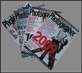
I get some magazines on a regular basis which feature tutorials and reviews of new equipment. They often carry features from professional photographers who give their insights to their area of photography and these can be very interesting and informative.
 
Pro Photographer Mag 1


Sunday 16 January 2011

Print Run 1 - D S Colour Labs


With these photographs being printed by D S Colour Labs, it is important that they are sent early to ensure that they are ready for Saturday 22nd January 2011, when this course finishes.

I have used D S Colour Labs before and I am happy with the quality of their work, previous less important orders were seen as test prints, and based on these I am more than happy for them to undertake this job.

I use the online printing option provided

D S Colour Labs - options

The first stage was to select the print size and finish for the photographs

DS ColourLabs - Paper Size and Finish

Next it was a case of selecting the photographs and uploading them to D S Colour Labs

Upload Images

Once the photographs had been uploaded it was a case of final checking and having the option to vary the sizes, print finishes and quantities of the photographs to be printed, before finalising the order and paying for them.

One valuable service they provide is to update you via email about the status of your prints.

There are three stages:

  1. Order Received
  2. Responsibility is taken for the printing of the photographs
  3. Prints are despatched

Immediately after paying for the prints I received the first email:

Scr000019

The following day I received another email, stating that the photographs had reached to second stage:

Scr000018

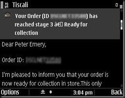
Later that same day, I received the last email:

Scr000017

Features like this are very important to people and businesses as it keeps them up to date with the progress of their order, and on each email there was a brief summary of the order, which is handy if you have more than one order being printed at one time.

The company has the ICC (International Colour Consortium) profile for their printer, matched to the actual paper used available on their website for complete colour management control.

D S Colour Labs - ICC Profile

The prints are due for delivery tomorrow.

Saturday 15 January 2011

Preparation for the Print Runs – Test Prints


Before starting an important print run it is important to carry out a test print to check the colours that are on your screen are reproduced correctly on the final print.

When sending the prints to a company like D S Colour Labs, it is a good idea to make up an image of smaller versions of what you want the final prints to be to check how they will come out, before paying out for full sized A3 prints.

To do this I created an A3 document in Serif PhotoPlus X4, which had small versions of each of my final prints, and uploaded this to their site. 

Test Print

One thing that I wanted to check is the auto correct feature which is supposed to correct the slight darkening that many of us have found when sending our prints to them for competitions, exhibitions and college work.

Although an expensive way, considering the standard delivery charge applied for any quantity of prints, making this print cost £5.00 (£1.05 print and £3.95 postage), I could make sure that the prints came out as I wanted them first time.

I used a similar idea at the college, using an old piece of A3, which failed to print correctly to check how the colours and saturation looked on the photograph that I was to print at college, before committing to printing the final print on a new piece of A3 paper.

Architectural Photography Techniques

For this assignment I built (pun intended ;-)) ) on what I learnt during the landscape assignment involving using light, but this time I wanted to try to use the light to illuminate the buildings, or elements of them, in different ways.

This time I had to be careful when using wide angle lenses, to avoid parallax (or converging vertical) errors which have marred many architectural photographs.  By taking some architectural photographs from a distance using the 18 - 200 mm or 75 - 300 mm lenses, zooming in to remove distractions, and frame the building  vertically in the viewfinder, I could capture the whole of the building, but without any of the above problems.

Ideally, I would use a tilt and shift lens for this type of photography, like the one shown below:

These lenses enable the camera to capture tall buildings without angling the lens up towards the top of the building, causing the converging verticals distortion.

Below is an example of using both normal and tilt and shift lenses:


But these lenses are very expensive, and have limited uses, so unless I wanted to specialise in this photography I would have to photograph buildings from a distance, or correct the images later in the post production stage.

Macro Photography Techniques

Having covered product photography during the last course, I learnt a few valuable techniques for this assignment.  But this time, I wanted to photograph the subjects using the Pentax DSLR and not rely so much on the Fujifilm S7000.  This combined with the subjects being natural and situated outside in the garden.

The first consideration was the light, which was not as controlled as when I was taking the product shots, because now I was photographing the subject outside the house, where I wanted to use the natural light, only using a reflector when necessary to illuminate any dark areas that I wanted lighter to show the detail, as opposed to using the studio lights in the Burton College photographic studio.

The next consideration was focusing.  The S7000 has a macro mode and a super macro mode, the latter of which can focus down to 25mm.  Although I do not own a proper macro lens, some of my lenses can focus down to 450mm.


So this meant that that I could not get as close to the subject, as I could with the S7000.  This meant zooming in closer.  With the Tamron 18 - 200 mm lens this zoom range was the whole 18 - 200 mm, where as with the Sigma 75 - 300 mm lens only the focal range of 200 - 300 mm was available for macro use.

Next, I chose a large aperture to concentrate the viewer on the subject, rather than the background.  Working at larger apertures kept the depth of field shallow, blurring out the background.
 
Proper macro lenses have a reproduction factor of 1:1, life size, other lenses which can be used for macro work sometimes do not offer this.  But to me if the image is to be printed so people can see it clearly I will accept this and not buy proper macro lenses which cost more and, like the tilt and shift lenses used for architectural photography, have their own specific uses.


Saturday 8 January 2011

Preparation for Printing

I have decided to produce two A3 prints, one from each section, via the college printer, and the remaining eighteen prints via D S Colour Labs.

The paper used at the college is HP Satin Matt A3+ 250g/m2 (Q5462A):


Specifications shown below:


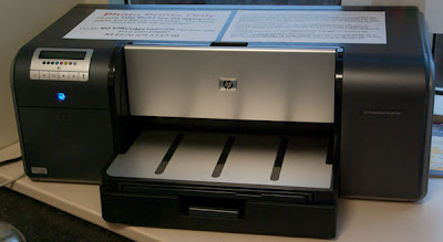
for which their HP Photosmart B9180 printer is calibrated for.


Above the printer is a set of calibration charts that have been used during the calibration process, just in case there is a problem later, where the original charts can be compared to newly printed charts.


Because the printer is calibrated to suit the paper that the college request the students to use on this printer, the images should come out to match the image perfectly.

This paper will give a fine finish to the printed images, without reflection or glare, which I found when I had some prints for last year's exhibition, twenty-ten at the college.  The reflections that resulted as a result of using pearl finish paper, which is glossy, showed up any marks that were the results of the photograph being mounted, which I felt let down the final work.

The printers use genuine HP ink cartridges and are checked on a regular basis to prevent any common printing problems such as banding (horizontal lines), ink run (vertical lines) and general poor printing quality.