Saturday, 27 November 2010
Local Architecture - Part 2
Wednesday, 17 November 2010
Printer Problems - Inkjet Printers
As inkjet printers are the most common printers used at home for printing, I will cover this type of printer.
Prints are lighter than expected or prints contain white spots or horizontal lines.
Below is an example of banding:
 |
Vertical lines are jagged
This is usually a sign that the print head is out of alignment. There’s not much you can do to avoid this problem - all print heads become misaligned over time.
In this case it is simply a case of checking what paper the printer has used and if it's the right way round.
Colours are missing or prints lack shadows and contrast
Vertical lines down the print, either on the front or on the back
This means that at some stage ink has got onto the guide or rollers of the printer.
Odd looking text being printed out instead of your photograph
This is usually a sign that there is a problem with the printer driver, which translates what the computer is sending to the printer to what is printed out.
Paper constantly jamming
Multiple pages fed through at once
This is usually a case of not using any form of colour management.
Basically it is a case of setting up your camera, monitor and printer to interpret colours in the same way, so that skin tones come out correctly, matching what you actually saw before you took the photograph.
This might sound odd, but, I have noticed a distinct difference when printing out the same photograph on my Epson printer and Canon printer. The Epson seems colder, with a slight green cast, whereas the Canon produces a warmer tone.
No print out at all
Check the printer queue or status monitor, to see if the print has gone to the printer, if you have more than one printer make sure it has gone to the correct printer:
often under the status heading a warning will appear if the printer is offline or out of paper or ink.
General Printer Care
Basically, it is a case of taking care of the printer,
- watching ink levels (many now have utilities that warn you when the ink is getting low) both on the printer (flashing LEDs) and sometimes on the computer (a window opening up).
- Make sure all connectors are in securely.
- carefully remove paper from the printer, if you have to pull the paper out, which could damage the paper feed mechanism, check that there are no missing pieces, which could lead to paper jams.
- only use good quality ink, poor quality ink will produce poor quality prints and may clog up the print heads
- only move the printer when you have to, certainly not when it is printing.
- Always keep plenty of ink, a spare cartridge of each if possible, because you never know you might run out of ink at a bad time, or late at night, trust me, I know !
Types of Computer Printer
Daisy Wheel Printers
- The dots are extremely small (usually between 50 and 60 microns in diameter), so small that they are tinier than the diameter of a human hair (70 microns)!
- The dots are positioned very precisely, with resolutions of up to 1440x720 dots per inch (dpi).
- The dots can have different colours combined together to create photo-quality images.
Most dye-sublimation printers use CMYO (Cyan Magenta Yellow Over coating) colours, which differs from the more recognized CMYK colours in that the black dye is eliminated in favour of a clear over coating. This over coating (which has numerous names depending on the manufacturer) is also stored on the ribbon and is effectively a thin laminate which protects the print from discoloration from UV light and the air, while also rendering the print water-resistant.
Monday, 15 November 2010
Colour Management
Colour management is very important to ensure that the printed photograph looks the same as what the image on screen does.
The problem with trying to produce photographic prints that look exactly like what the photographer first saw, is that each device; the camera, the computer / monitor and the printer has its own limit on how it can handle the colour spectrum.
Whilst the camera and computer / monitor can handle their range of colours and tones, sometimes called their colour spaces or gamuts, the printer then has to translate this collection of colours in the format of RGB (Red, Green and Blue) and translate these into its gamut in the format of CMYK (Cyan, Magenta, Yellow and blacK).
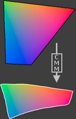
As you can see from the diagram below, there are still some differences in the actual colours tones that are displayed on the computer screen and those on the final print out, which appear more muted and less vibrant:
An important consideration is the type of paper used for the final print out, as using normal paper would result in very drab colours with plenty of colour bleeding into other colours on the paper.
The above diagram demonstrates the difference between the RGB and CMYK colour gamuts. The CMYK colour gamut is much smaller than the RGB colour gamut, thus the CMYK colours look muted. If you were to print the image on a CMYK device (an offset press or maybe even a ink jet printer) the two sides would likely look much more similar, since the combination of cyan, yellow, magenta and black cannot reproduce the range (gamut) of colour that a computer monitor displays. This is a constant issue for those who work in print production.
One reason for the differences in the colours and tones available between RGB and CMYK is that RGB uses additive colour mixing, because it describes what kind of light needs to be emitted to produce a given colour. Light is added together to create form from out of the darkness. RGB stores individual values for red, green and blue. RGBA is RGB with an additional channel, alpha, to indicate transparency.
 |
| Additive colour mixing: Three overlapping light bulbs in a vacuum, adding together to create white. |
Common colour spaces based on the RGB model include sRGB, Adobe RGB and ProPhoto RGB.
CMYK uses subtractive colour mixing used in the printing process, because it describes what kind of inks need to be applied so the light reflected from the substrate and through the inks produces a given colour. One starts with a white substrate (canvas, page, etc), and uses ink to subtract from white to create an image. CMYK stores ink values for cyan, magenta, yellow and black. There are many CMYK colour spaces for different sets of inks, substrates, and press characteristics (which change the dot gain or transfer function for each ink and thus change the appearance).
 |
| Subtractive colour mixing: Three splotches of paint on white paper, subtracting together to turn the paper black. |
- sRGB
- AdobeRGB
with the later colour space yielding a much more range of colours and tones, but, as you can see from the diagram below:
none of the available colour spaces cover all of the visible colour spectrum.
To try and solve this problem of accurate colour reproduction on both the computer display and the final printout, the ICC (International Colour Consortium) developed a range of ICC profiles which can be used to more accurately translate the true colours from one device to another to ensure the finished photograph looks the same as what the photographer first saw through their viewfinder.
These ICC profiles are simply look-up tables that describe the properties of a colour space. They define the most saturated colours available in a colour space; ie the bluest blue or deepest black your printer can produce. If you don't have a profile, the trio of Red, Green, and Blue values (or CMYK (Cyan, Magenta, Yellow and Key or black)) that make up a colour have no particular meaning — you can say something is blue, but not exactly which shade of blue. Accurate profiles are the key to a colour-managed workflow. With accurate monitor and printer profiles, your prints will closely match what you see on your monitor. Without profiles, you need to rely on trial and error combined with good old-fashioned guessing.
Colour Space Conversion
| Input | Conversion | Output | ||
 |  |  |
Colour space conversion is what happens when a colour management module (CMM) translates colour from one device's colour space to another. Conversion may require approximations in order to preserve the image's most important colour qualities.
The translation stage attempts to create a best match between devices-- even when seemingly incompatible. If the original device has a larger colour gamut than the final device, some of the those colours will be outside the final device's colour space. These "out-of-gamut colours" occur with nearly every conversion and are called a gamut mismatch.
 |  |
Saturday, 13 November 2010
Marking Criteria for Assignment 205
| Pass | |
| The candidate has provided: | |
| P1 | The minimum relevant information of equipment and materials |
| P2 | Limited evidence of equipment and accessories knowledge |
| P3 | Limited account of the operation of equipment |
| P4 | Reasons for choice of equipment and materials which are not substantiated |
| Merit | |
| The candidate has achieved everything at pass grade and provided: | |
| M1 | Evidence of clear explanations for the choice and operation of a range of materials and equipments |
| M2 | An explanation showing clear evidence of function and operational knowledge |
| M3 | Information in a clear and logical manner |
| Distinction | |
| The candidate has achieved everything at pass and merit grade and provided: | |
| D1 | Clear and coherent explanations for the choice of materials and equipment |
| D2 | A detailed explanation showing clear and consistent evidence of function and operational knowledge |
| D3 | A structured and substantiated explanation which fully supports the final choice of equipment and materials |
| D4 | Clear and consistent evidence of consideration given to alternatives with evidence of informed reflection |
Marking Criteria for Assignment 310
| Pass | |
| The candidate has provided: | |
| P5 | Two series of ten finished thematic printed images of acceptable quality |
| P6 | Evidence of the use of equipment and materials |
| P7 | Limited evidence of checking for potential printing problems |
| P8 | Limited evidence of the use of test print procedures or colour management |
| P9 | A minimal account of alternative printing processes and techniques |
| P10 | A limited technical evaluation |
| P11 | Provided the minimum relevant information in the workflow |
| Merit | |
| The candidate has achieved everything at pass grade and provided: | |
| M4 | Two series of ten images which clearly relate to the themes |
| M5 | Clear evidence of effective use of materials and equipment |
| M6 | A structured explanation of the use of equipment and materials |
| M7 | Clear evidence of checking for potential printing problems with solutions provided |
| M8 | Clear evidence of the use of test print procedures or colour management |
| M9 | A structured account of alternative printing processes and techniques |
| M10 | A structured technical evaluation that supports the final printed images |
| M11 | Clear and relevant information in the workflow |
| Distinction | |
| The candidate has achieved everything at pass and merit grade and provided: | |
| D5 | Two series of ten images of optimum quality that all relate consistently and coherently to the themes |
| D6 | Clear and consistent evidence of effective use of materials and equipment |
| D7 | A structured and substantiated explanation which fully supports the use of equipment and materials |
| D8 | Workflow which provides clear and consistent evidence of understanding the processes |
| D9 | A technical evaluation that demonstrates a high level of knowledge |
Marking Criteria for Assignment 212
| Pass | |
| The candidate has provided: | |
| P12 | The minimum relevant information required by the task |
| P13 | limited evidence of resource, time and cost estimation |
| Merit | |
| The candidate has achieved everything at pass grade and provided: | |
| M12 | Provided clear evidence of resource,time and cost estimation |
| M13 | Presented information in a clear,logical manner |
| M14 | Provided information which shows evidence of understanding |
| M15 | Completed the task with minimal assistance |
| Distinction | |
| The candidate has achieved everything at pass and merit grade and provided: | |
| D10 | Provided clear and consistent evidence of resource, time and cost estimation |
| D11 | Provided information which indicates clear evidence of understanding |
| D12 | Worked with a high level of independence |
Friday, 12 November 2010
Ezra Stoller
Having studied as an architect, it gave Stoller’s an architect’s eye and discipline that moved him to capture on film the structure and spirit, body and soul of the icons of Modern architecture, from the Louis Kahn’s Salk Institute in La Jolla to Eero Saarinen’s TWA terminal in New York and close to all of the great postwar buildings in between. Often, the image we carry in our mind’s eye of any particular great building was first seen through a lens by Ezra Stoller. He managed, in a career that spanned more than five decades, to capture not only the architecture, but also the times and culture embodied in each piece of work. His photos continue to be featured in countless books and magazine articles, and in art exhibitions worldwide.
In 1990 Ezra's photographs were published in Modern Architecture: Photographs by Ezra Stoller, which features 400 of his most important works, along with his writing about the pictures, the buildings, and the architects who designed them
On 29th October 2004, Ezra passed away after complications following a stroke.
Examples of Ezra's photography:
Falling Water | Finnish Pavilion |
Guggenheim | New Harmony |
Seagrams Interior | Chamberlain Cottage |
Kitt Peak | Notre-Dame-du-Haut Chapel |
Manufacturer's Trust | Whitney Interior |
Evaluation of Images
The unusual shapes and forms in the Finnish Pavilion photograph, with the subtle lighting and the contrasts, not just in light but also with the inclusion of the plant in the bottom right of the photograph and the unusual shapes of the building.
Julius Shulman
When Julius was 10, his family moved to Los Angeles and opened a dry goods store. His father died of tuberculosis in 1923, leaving his mother with their five children and the business.
Julius attended Roosevelt High School, where he took his lone photography class. He spent the next several years soul searching and earning his rent money by taking photos with an Eastman box camera. One picture of a bridge won first place in a national magazine contest.
Examples of Julius’s work
 | 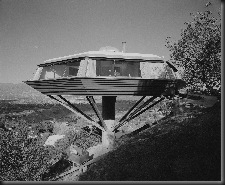 |
| Case Study House #22 | Chemosphere |
 | 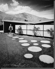 |
| Fire Station No 28 | Palm Springs House |
 |  |
| Prairie Chicken House | Juergen Noga |
 |  |
| Freeman House | |
Evaluation of Images
Julius's photographs include some colour photographs as well as black and white photographs.
Tuesday, 9 November 2010
Fireworks


Local Architecture–part 1

Above is a view of the University block of Burton College, in fact the building in which we are studying this course.
Burton has a number of older buildings, which have their own style (like the University Block above), here are some examples:
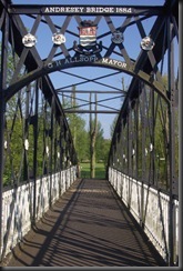 | 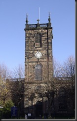 |
Andressey Bridge | St Modwen’s Church |
 |  |
Burton Market Hall | Old Building at mouth of Burton Market |
Saturday, 6 November 2010
Architectural Photography
 |  |
Arch at Whitby Abbey | Part of Whitby Abbey |
 | |
Nat West Bank – Whitby | |
 |  |
St Mary’s Church – Whitby | St Mary’s Church – Whitby |


